


In Part 1 of this three-part series, I examined Michael Mauboussin and Dan Callahan’s work on Return on Invested Capital and suggested Indivior Pharmaceuticals could be an interesting investment to consider as a result.
In Part 2, I dig into more companies from the study, those on the frontier of ROIC, and discuss another very interesting and potentially undervalued stock.
As we discussed in Part 1, Mauboussin and Callahan break a company’s return on invested capital into two components: its operating margin (how much revenue can the company “keep”) and its invested capital turnover (how much and how quickly can it sell stuff).

I then discussed how Mauboussin and Callahan show each of the top 500 companies in the Russell 3000 as a dot on a chart plotting these two terms using 2022 data. I updated the chart to widen the scope, ultimately including 1,769 companies, and using data from the trailing twelve months.
That chart is below, along with a view that highlights the companies with the highest invested capital turnover. See Part 1 for more.
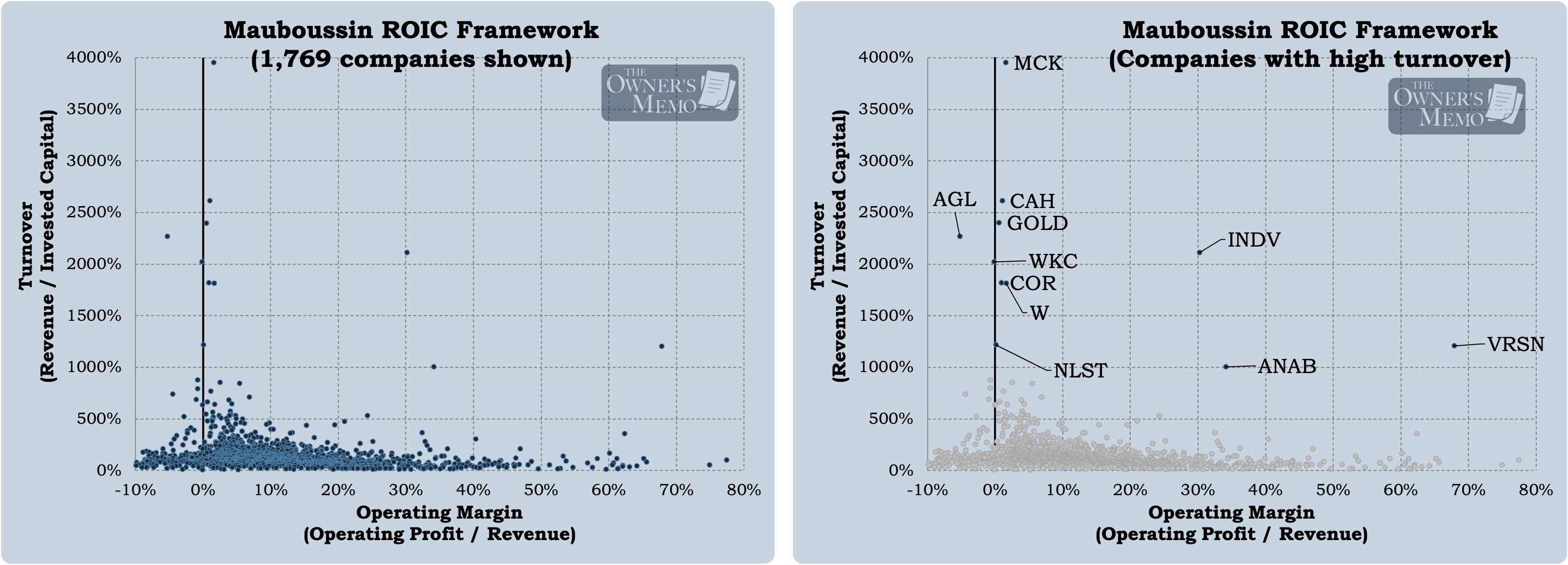
Mauboussin and Callahan identify those companies toward the top left of the chart as “cost leaders,” those companies with high turnover and low operating margin. These are companies that sell a lot of goods or services, but that don’t generate very high profits on any given sale.
On the right and bottom right of the chart are “differentiators,” those companies with low turnover and high operating margin. These companies sell comparatively less, but on each sale, they generate very large profits.
I started digging deeper into the chart by looking at those companies with the highest turnover (the right chart in Figure 1), and from that work, found Indivior Pharmaceuticals, one of three companies on the chart with very high turnover and operating margins.
Now, let’s continue the work by looking at some other companies on the chart, starting with some names that are more familiar.
The Top 25 Companies by Market Cap
The chart below shows the same breakdown of companies by turnover and operating margin. On the left, I have truncated the y-axis to make the trends more visible, and on the right, I highlight the top 25 companies by market cap.
These are names you will recognize.
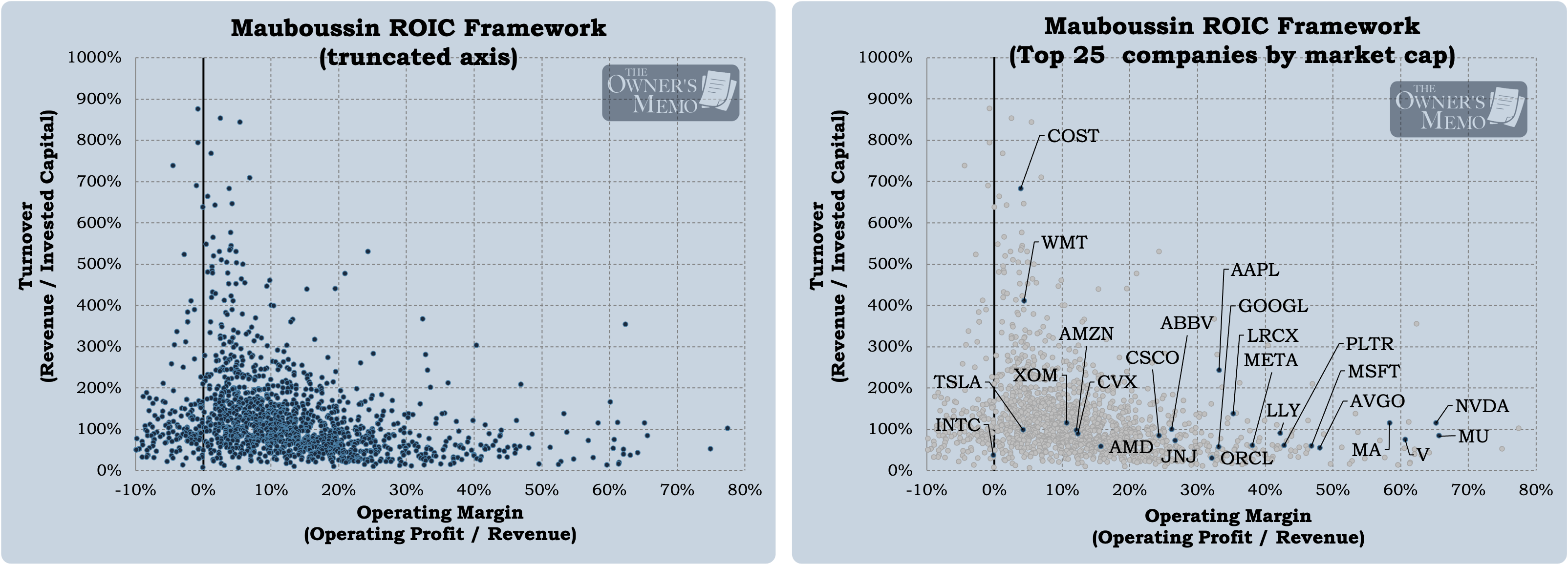
With this view and these familiar companies, Mauboussin and Callahan’s point really hits home. Pretty quickly, we can see what the authors were referring to with the two buckets, cost leaders and differentiators. At the top of the chart are Costco and Walmart. These are companies that seek to sell a lot of goods and services by selling them for low prices. Costco and Walmart also do this by having stores conveniently located close to their customers. Other companies in the cluster (that are not shown because their market caps are lower) have higher turnover by requiring less invested capital, like service businesses, or by having recognizable brands or strong distribution.
In the bottom right live those companies that differentiate. They offer their customers something no other company can provide. Visa and Mastercard, of course, have the dominant credit card networks in the world. Nvidia creates computer chips that are unparalleled in performance. Palantir is a cutting-edge software company focused on the defense sector and built to use modern technologies in an industry the founders felt was becoming too complacent.
That list goes on, and all of the names on it are well-known. Many (but not all) trade at multiples of annual earnings or cash flow that are relatively high. An investor could make a whole career out of studying this chart and focusing on the best names at the best prices. Chris Hohn springs to mind.
But what about smaller companies? We have a couple thousand dots on the chart to explore after all.
Examining the Frontier
Are there any differentiators or cost leaders buried in the dot plot that might surprise us? Instead of arbitrarily cutting off the data at some level of turnover or some high level of market cap, let’s try to isolate another set of companies: the ones that are as close as possible to the top-right edge of the cluster.
“Top-right” means those companies with either high turnover or high operating margin or both. By maximizing those two metrics, we will be focusing on those companies with the highest ROICs.
The chart below shows just that: a curve that isolates 44 companies that are highest in combined turnover and operating margin, with pre-tax ROIC over the last twelve months greater than 45%.1
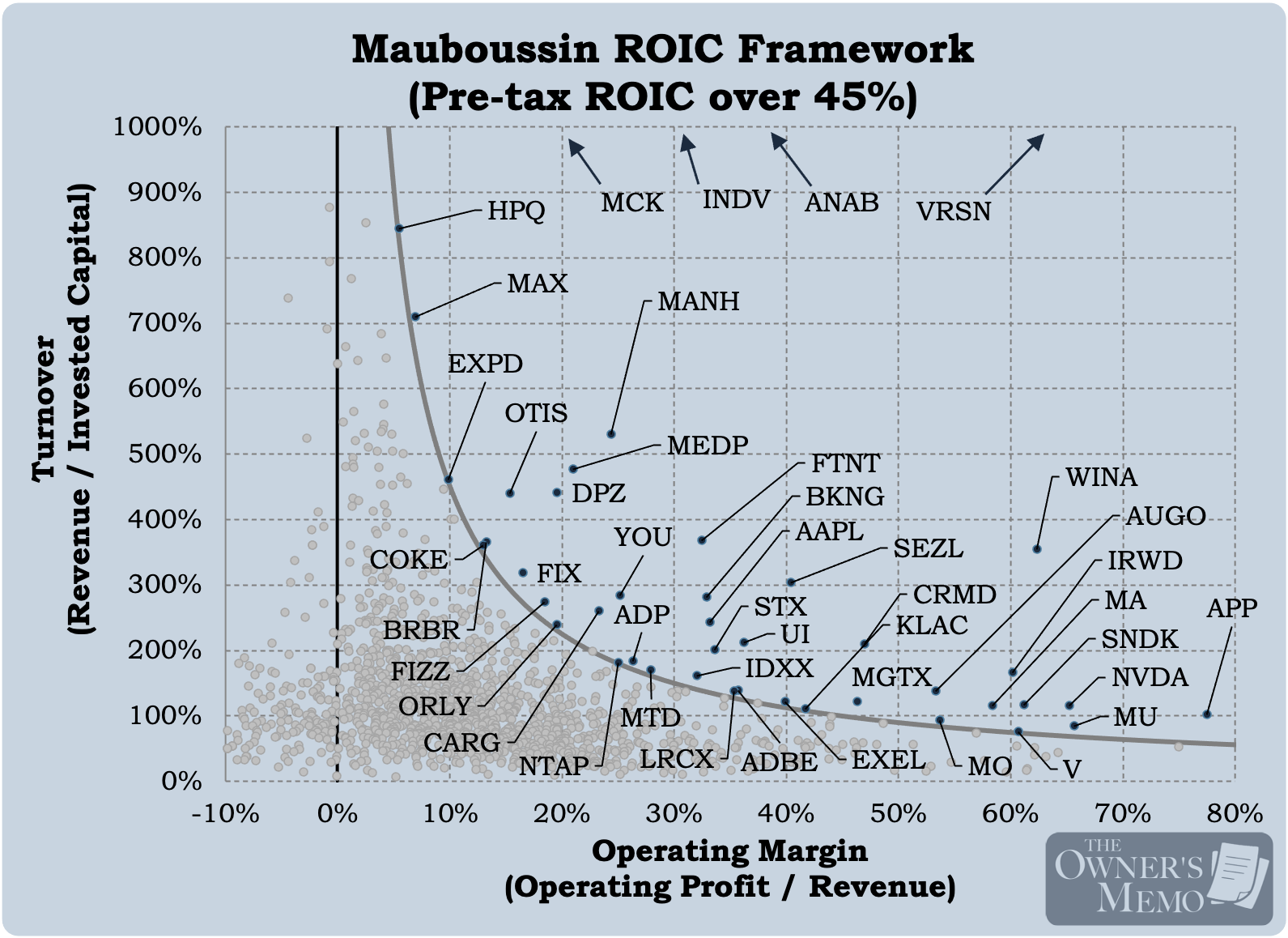
The companies on this chart produced a pre-tax return on invested capital greater than 45% over the past twelve months. Interestingly, we can see names from both the Part 1 breakdown and the one above:
There are a few companies on the chart, like McKesson (MCK), Indivior (INDV), and AnaptysBio (ANAB) that have the highest turnover of invested capital out of any companies, and
there are also some of the largest companies in the world with the highest operating margins on the chart, like Nvidia (NVDA), Mastercard (MA), Visa (V), Micron (MU), and Apple (AAPL).
Looking at the chart above is akin to selecting for those companies that have the highest pre-tax ROIC of any in public markets. It’s a pretty good place to start to study great companies and to search for great investments, but it tells us nothing about the valuation of each company in the market and therefore nothing about each company’s relative attractiveness as an investment.
So, in the table below, I added a valuation measure. For each of the names on the chart, I show the Forward Price to Free Cash Flow ratios from Fiscal.ai. To make the list a little more manageable, I also introduced one more constraint: I required company operating margins to be increasing every six months for the past year and a half. I wanted to narrow the list to those companies that had both strong ROICs and whose business appeared to be improving.
That constraint limits us to eight names out of the original 44. They are shown below, along with their forward P/FCF ratios.
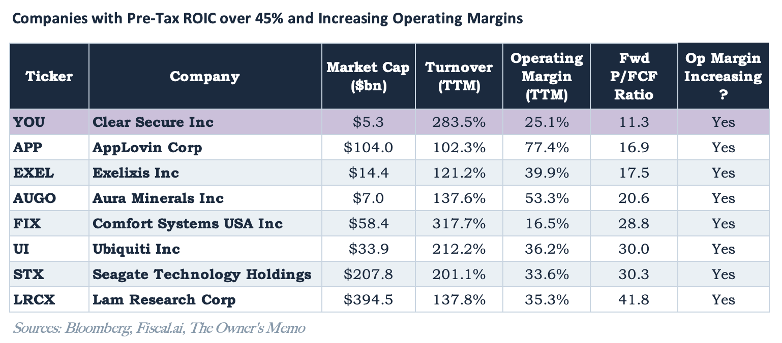
Each of the companies on this list is great in some way, but the companies toward the top of the list are especially interesting because of their relative cheapness. And one name stands out versus the others.
Clear Secure (Ticker: YOU)
Clear Secure, Inc. is a secure identity company that is best known for its CLEAR+ security subscription service which provides travelers a more convenient security experience at airports. They also have other security products, like a similar offering for stadium security and a B2B product for identity verification.
As of October 11, the company had a market cap of $5.7 billion, an enterprise value of $4.8 billion, and a stock price of $42.47. (Note this is slightly different than the data in Figure 4, which was taken as of September 25.)
The company went public on June 30, 2021 at $31 per share and has delivered revenue growth each quarter since that time. Its latest quarterly revenue was $277.8 million, up 26.6% year-over-year. The company’s total number of CLEAR members (which is a free product) grew to 43.5 million, up 30.0% year-over-year, and the number of active CLEAR+ members grew to 8.3 million, up 15.2% year-over-year.
Their latest quarterly financial report also exhibited a 68.6% gross margin (up consistently from 58.5% since Q3 2021) and a 29.9% operating margin (again, up consistently from -48.2%).
Below is the company’s income statement from the past three years (plus the trailing twelve months), highlighting the increases in revenue and margins.
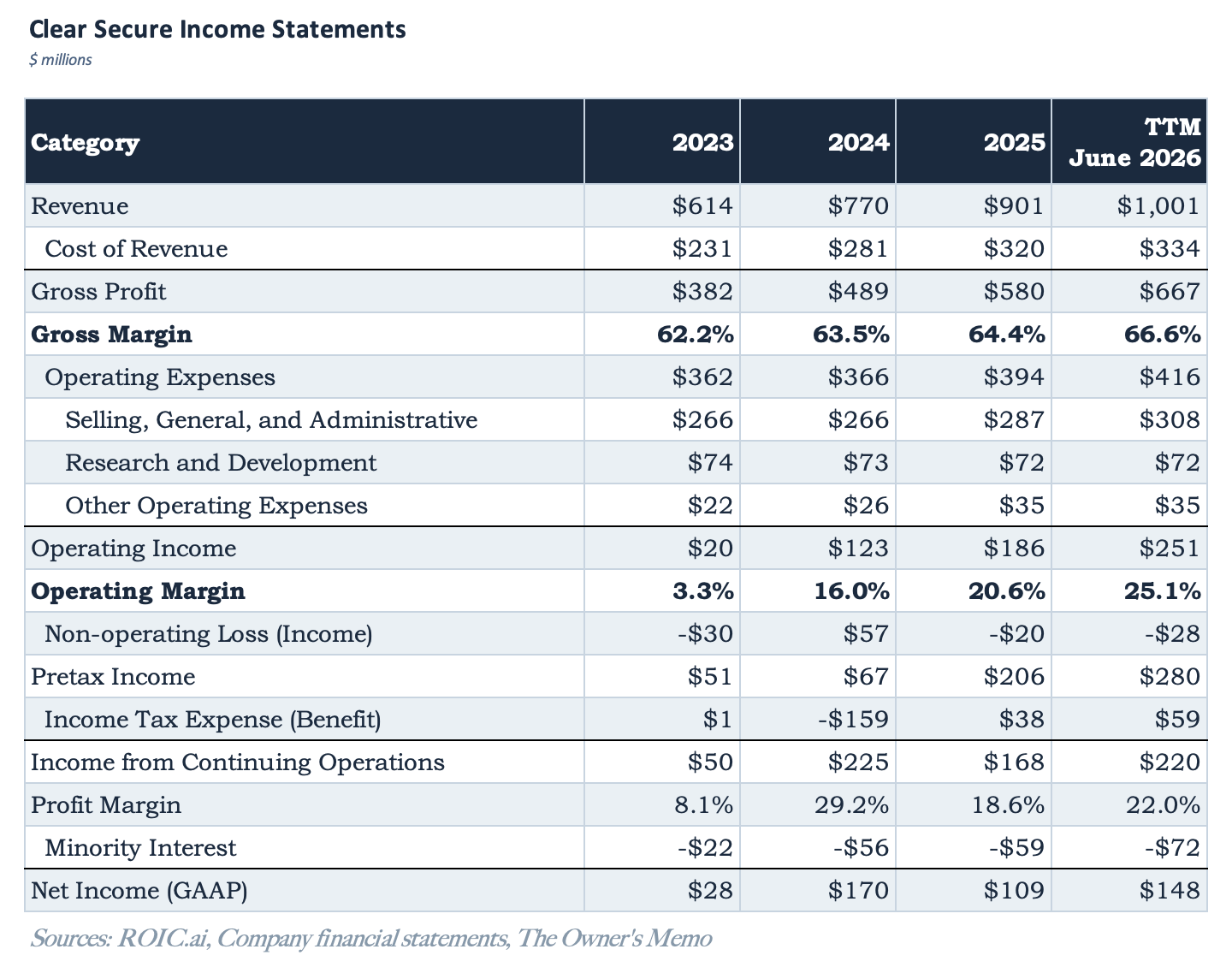
At a market cap of $5.7 billion and earnings of $72.3 million for the quarter ended June 2026, the company trades at a P/E on annualized earnings of 19.9x, with quarterly earnings that were up 86% year-over-year.
In addition, the company has the benefit of taking CLEAR+ subscription payments up front, which is why it has $572.9 million in deferred revenue on its balance sheet. That has the benefit of boosting cash flow for the business, reducing invested capital needed, and increasing ROIC.
There are, of course, risks around the company. The investment case for Clear Secure will depend heavily on the company’s ability to continue growing, which will involve convincing more travelers and businesses of the value of convenient, streamlined security. The company’s main product is discretionary and not critical, which poses some risk in the event of a recession or otherwise.
Also, the company went public with an Up-C structure that resulted in four classes of stock being created, two of which are outstanding today, Class A and Class C.2 Anyone analyzing the company should be aware of this distinction, which can confound per-share metrics and forward projections if not properly accounted for.
At 19.9 times earnings, Clear Secure is not obviously cheap, but if growth can be expected to continue, the stock may be a bargain. The company has executed very well to date, as evidenced by the high return on capital it achieves and its continued growth.
I will be doing more work on Clear Secure in the future to determine if it rises to the level of attractive enough to own.
In Part 3, we’ll examine one other surprising aspect of Mauboussin and Callahan’s ROIC work and discuss two more potential investment opportunities, companies that are not on the frontier but may soon be.
Disclaimer
The Owner’s Memo is published for informational and educational purposes only. Nothing here is investment, legal, or tax advice, or a recommendation to buy or sell any security. The content is general and does not consider your individual circumstances, objectives, or risk tolerance. I am not a registered investment adviser or broker-dealer.
I may own positions in securities I write about, and I disclose any position at the time of publication. My views may change without notice, and I have no obligation to update prior posts.
Investing involves risk, including loss of principal. Past performance is not indicative of future results. The information here comes from sources I believe to be reliable, but I make no guarantee of its accuracy or completeness. Do your own research and consult a qualified professional before making investment decisions.
Since each axis of the chart shows one component of pre-tax ROIC (turnover and operating margin), the curve we are creating is the product of both terms, a curve of constant pre-tax ROIC, in this case with a value of 45%.
Class B and Class D shares were sunset on July 2, and today, only Class A and Class C shares are outstanding. Class A shares carry voting rights and economics. Each Class C share carries a vote and is paired with an Alclear Holdings unit that holds the economics and can be exchanged one-for-one for Class A. Only Class A trades publicly, and it accounts for about 76% of the combined share count.
I continue to be amazed Clear is still in business. I've had it for years (free through a CC), but I think I use it once per year at most. TSA is slowly but surely improving, and "Touchless" beats Clear every time.
I bought another digital security company recently: OneSpan. They have navigated the hardware -> subscription software transition after years of efforts from an activist fund called Legion Partners. In the worst case, stock is roughly fairly valued around $17. Best case, stock trades at a higher multiple (now it’s about 2.5-3x EV/ARR for a business that’s not growing much) and can go up, if I recall correctly, 60-100%. The counter argument is that a non-growing SaaS company does not deserve multiple expansion. It depends on whether they can increase maintenance revenue.